
Thursday, January 19, 2012

Principles Practice

Before:


After:


With the shapes I really wanted to use color to first get them into pertinent groups. Then I used the different shapes and their qualities to form different designs. I especially like the teal "swirl" that I created using the moon-like shapes. I think you can hardly tell that it is three separate shapes, but that they have all come together to form one new design.


Before:


After:
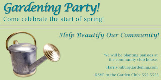


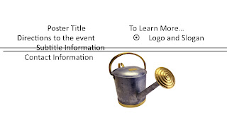
For the garden party poster, I really used the idea of alignment to create the design. I have taken classes on designing magazines and brochures and things before, so I remember some things from that. I like the different font choices and having the text read from left to right, top to bottom. I think the colors could probably be more interesting, but I think it is a readable design that I'm happy with.

Arbitrary Graphic


I wanted to use colors and shapes to help represent this information. We had recently done some work with powerpoint, and I learned a bunch of new things to do with shapes and colors that weren't available to me on the version of powerpoint I have on my own computer.

I used the idea of arrows to show the concept of moving through a schedule, and I tried to use colors like red when something was ending, and the same colors when the same thing was happening (like green with the two post test surveys.)

Tuesday, January 10, 2012

First Day

Welcome to my Visual Literacy Blog! Today was our first day of class. We created these blogs so that we have a forum to share all of the projects we create during this course. Educational Media is one of my minors, and I am excited to learn more about visual literacy and how to use it to appropriately help educate others during this class!