Thursday, April 26, 2012
Our assignment this week was to create an image using words and word placement. As I will be graduating from JMU and leaving my beloved sorority behind, I have been a bit nostalgic lately. I chose to make deltas with my words. I am a little sad about leaving, so I wanted my last project to be something I love and care about! So here is what I made, I used a picture of a delta, then filled it with words that are meaningful to me and my sorority, and then deleted the background. Hope you like it!
Tuesday, April 10, 2012
Color
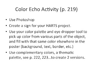
Today we worked on the idea of color. We talked about primary, secondary, and complimentary colors. The first color palette I wanted to work with was primary because my eye usually doesn't go to primary colors, and it's not a palette I work with often. I used red, blue and yellow to create what I think is a fairly cohesive informational poster!

The poster I was creating is for a project we are doing for an on-campus church. The colors of JMU as well as the colors of the church are purple and yellow, which are also complimentary colors. I wanted to work with that to create something that could possibly be used in real life. I know the colors on this poster are a bit more pastel than bright, but I think they work and are an interesting/fun play on JMU's typical colors!
Gestalt
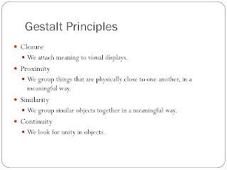
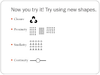
This was a very interesting project. I enjoyed the fact that we could only use black and white to depict the different images. Here are the pictures I came up with...


My favorite one that I created is the continuity one. I think it's visually appealing and goes with the concept of unity throughout the object.
Tuesday, February 28, 2012
Alignment
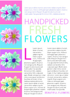
For this assignment, we were supposed to alter a picture from the book that was advertising handmade chairs. I haven't made anything that's neccessarily "pretty" yet, so I wanted to take this time and do something bright and fun with pretty flowers.
I used photo shop to create all of the different effects. The one that I used most was the hue and saturation button to change the colors of the different flowers and backgrounds. It was a little difficult to get the spacing and alignment down with the words on photoshop, but I think it ended up looking similar to the original, with my own little spin on it!
Thursday, February 23, 2012
Emphasis
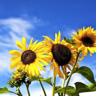
Today we worked on emphasis in design. Emphasis is important when working with images, because there are times when you want to direct the viewers eye to a certain aspect. With the assignment given, I wanted to work with color and see how I could change an image to emphasize only one aspect of the photo.
Here is the initial photo:
Here is the photo after:
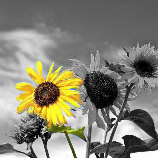
I used photoshop to add a black and white filter on the image, and then I wanted just one of the yellow flowers to stand out.
Tuesday, February 21, 2012
Harmony Project

This assignment also proved a little more difficult than I had initially thought. My immediate thought was to go the social studies route and use the visual of a map, however after hearing my professor further explain the assignment, I realized I needed to go a step further and actually have a visual that is literally showing a learner something that they can later do.
I chose fractions and decided to use a pie, because I think that's all something that we used to learn fractions when we were little. I used photoshop to edit the original picture, then put it into powerpoint to organize it and add the words. Ultimately, I think someone looking at this would understand the fact that five pieces of pie is the whole pie, and taking one piece away is one-fifth of the pie, which was my goal.

Thursday, February 16, 2012
Grouping Poster

Given this assignment, I decided to choose the word "dreamer" to describe me. I wanted to depict the idea that I have big dreams for my career when I graduate, because it is something that as a second semester senior, I have been forced to think a lot about (especially recently). I always have had big hopes and dreams for the future, so I think the word "dreamer" really fits me in the sense that I have big dreams for myself and I hope to accomplish them.
Here is the poster I came up with and hope that you can see how the clouds in the sky represent a lofty, dreamy idea, and that the images in the clouds are what I am hoping to achieve! I used the clouds as a way to group each idea that I had, while they all somehow relate, they are all a different aspect of the ultimate dream.

Thursday, February 9, 2012
Grouping Practice

This grouping activity that we did in class was more difficult than I thought it would be! When I read some of the words, the ideas came to me right away, however for some I had trouble coming up with a way to depict what I was thinking.
I used grouping to show the different words more so in some cases than others (i.e. isolation and unity). I worked with colors and uneven spacing for others (such as for celebration with the bright colors and crazy placement to look like confetti, or the black scribble lines for anarchy to show chaos).


Thursday, February 2, 2012
Personal Poster

Today in class we worked on personal posters that reflect our own personalities and interests. This turned out to be harder for me than I had anticipated, but I am pretty happy with what I ended up with. I know that the assignment says not to split up the space with lines, but I am one that enjoys seeing things that are visually organized and that make sense in groups, so I decided to keep the different things in their spaces.
The three things I wanted to focus on were my sorority, Delta Delta Delta, where I go to school, JMU, and my hopes and dreams of working in broadcast news when I graduate. I wanted to mainly focus on the design concept of grouping. It made the most sense to me to focus in on a couple things I really love and to get a few images for each one.

Thursday, January 19, 2012
Principles Practice
Before:
After:
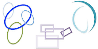
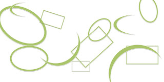
With the shapes I really wanted to use color to first get them into pertinent groups. Then I used the different shapes and their qualities to form different designs. I especially like the teal "swirl" that I created using the moon-like shapes. I think you can hardly tell that it is three separate shapes, but that they have all come together to form one new design.
Before:
After:
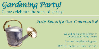
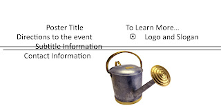
For the garden party poster, I really used the idea of alignment to create the design. I have taken classes on designing magazines and brochures and things before, so I remember some things from that. I like the different font choices and having the text read from left to right, top to bottom. I think the colors could probably be more interesting, but I think it is a readable design that I'm happy with.

After:

With the shapes I really wanted to use color to first get them into pertinent groups. Then I used the different shapes and their qualities to form different designs. I especially like the teal "swirl" that I created using the moon-like shapes. I think you can hardly tell that it is three separate shapes, but that they have all come together to form one new design.
Before:

After:

For the garden party poster, I really used the idea of alignment to create the design. I have taken classes on designing magazines and brochures and things before, so I remember some things from that. I like the different font choices and having the text read from left to right, top to bottom. I think the colors could probably be more interesting, but I think it is a readable design that I'm happy with.
Subscribe to:
Comments (Atom)


