Makenzie's Visual Literacy Blog
Thursday, April 26, 2012
Our assignment this week was to create an image using words and word placement. As I will be graduating from JMU and leaving my beloved sorority behind, I have been a bit nostalgic lately. I chose to make deltas with my words. I am a little sad about leaving, so I wanted my last project to be something I love and care about! So here is what I made, I used a picture of a delta, then filled it with words that are meaningful to me and my sorority, and then deleted the background. Hope you like it!
Tuesday, April 10, 2012
Color
Today we worked on the idea of color. We talked about primary, secondary, and complimentary colors. The first color palette I wanted to work with was primary because my eye usually doesn't go to primary colors, and it's not a palette I work with often. I used red, blue and yellow to create what I think is a fairly cohesive informational poster!

The poster I was creating is for a project we are doing for an on-campus church. The colors of JMU as well as the colors of the church are purple and yellow, which are also complimentary colors. I wanted to work with that to create something that could possibly be used in real life. I know the colors on this poster are a bit more pastel than bright, but I think they work and are an interesting/fun play on JMU's typical colors!
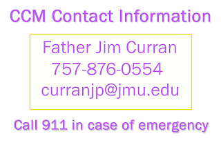
Gestalt
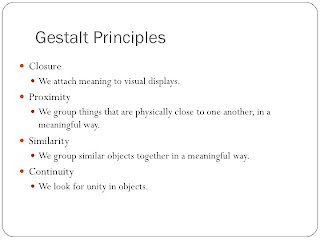
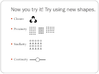
This was a very interesting project. I enjoyed the fact that we could only use black and white to depict the different images. Here are the pictures I came up with...


My favorite one that I created is the continuity one. I think it's visually appealing and goes with the concept of unity throughout the object.
Tuesday, February 28, 2012
Alignment
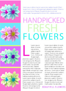
For this assignment, we were supposed to alter a picture from the book that was advertising handmade chairs. I haven't made anything that's neccessarily "pretty" yet, so I wanted to take this time and do something bright and fun with pretty flowers.
I used photo shop to create all of the different effects. The one that I used most was the hue and saturation button to change the colors of the different flowers and backgrounds. It was a little difficult to get the spacing and alignment down with the words on photoshop, but I think it ended up looking similar to the original, with my own little spin on it!
Subscribe to:
Comments (Atom)


